Think about the last time you shopped around for a new service – what can you learn from that experience to help you delight your customers?
As a human-centred designer, I find it almost impossible to just use services.
I’m always taking notes on what they’ve got right, so I can borrow ideas for my bag of tricks.
And, of course, I also take notes on what they get wrong, so I can help the clients I work with avoid the same mistakes. This is arguably more important.
As my colleague Kerrie Hughes explained in her post ‘Design with feeling’, the experience your customers have will resonate afterwards. They’ll tell their friends and colleagues and offer their opinions through social media.
If they had a bad time, the stories they tell won’t do you any favours.
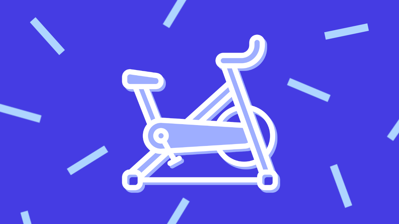
Let me tell you about a recent experience of my own: trying to join a gym.
Make simple tasks easy to complete
I had one basic need from my new gym: it had to offer Pilates classes outside of working hours. How complicated could that be?
I started with a Google search and looked at the gyms nearest to me. The first result was a local studio that had opened recently.
The first stumbling blocks were the unusual names they’d given to their classes. What does ‘The Realign’ mean? Or ‘The Games’? The only way to find out was to click through for more information.
But this didn’t help much because the descriptions of each class were more poetic than informative:
“This class is layered and suitable for beginners with body awareness and a good level of fitness. This class is complimented by specially curated playlists matching the energetics of the movements to guide you even deeper to the beauty within!”
After reading that, I was even more confused, and the questions continued to pile up.
If it’s for beginners, why would I also need to have a good level of fitness? Those “specially curated playlists” made it sound like a dance class. And what does “energetics of the movements” mean?
At this point, I gave up and called the phone number published – a sure sign that the digital journey wasn’t working – and was told they’d gone out of business. This turned out not to be the case: the number that appears on Google is just wrong.
How could it have been better?
Focus first on what customers need to know, not what you want to tell them. In practice, that means you should...
- Write functional class descriptions. Research their information needs.
- Take care naming the classes. This is a timetable not a marketing brochure, and it should convey the important information at a glance.
- Provide more contextual content. If the name of the class can’t do the job alone, provide a short description with it.
Let customers choose their own route
The second gym I tried, a posh health club, also provided a bad customer experience.
First, there were no prices on the website. Perhaps to underline its ‘premium’ brand. If you need to ask, you can’t afford it?
Secondly, it delivered information on classes in one huge, overwhelming timetable. As far as I could see, 95% of classes were unsuitable or irrelevant, but it was impossible to tell.
So, again, I decided to call them.
The person I spoke to really wanted to book me in for a visit to see the club. I told them I already knew it, but they insisted, saying it had recently been renovated.
What was the assumption here? I guess it was that my choice was being dictated by the quality and luxury of the facilities when, in fact, I didn’t much care about that.
I just wanted to know about the classes, and if the times were right for me. For that, they said I ought to come in for a visit and they could show me on an iPad.
I said I’d really like to get some help over the phone. Reluctantly, they spent 15 minutes reading the timetable themselves, before telling me which classes they thought ran after working hours.
At the end, they broke the news that this might not be right, because the timetable they had handy was for Christmas and the new year. A new timetable would be coming into effect in January.
Didn’t they have the new timetable ready to go somewhere, since January was only a week away? I spent another 10 minutes on hold only to learn that the person who might be able to answer my question had gone home.
My options at this point were:
- Sign up now and cancel within 14 days if the classes aren’t right for me.
- Call back tomorrow and go through all this again.
I agreed to sign up, and they emailed me a link to the enrolment page.
It turned out to be a hidden page, so users have to hand over personal data to progress.
How could it have been better?
- Make it possible to search, sort and filter classes. The data is there but it’s locked away in a clunky, non-dynamic document.
- Create a fully digital sign-up process. Insisting on customers having to talk to a salesperson is very 20th century.
- Train and brief staff to help customers above all. The hard sell, upselling, and data mining were off-putting and frustrating.
Third time lucky?
Finally, I decided to try a national chain that you might call “cheap and cheerful”.
Christmas seems to cause a lot of confusion. In this case, I couldn’t see the regular class timetable because it had been replaced by a PDF of a holiday timetable.
There was a note saying that I could see the normal timetable via the smartphone app… but I didn’t want to install it, just to complete this one simple task.
I resigned myself to another phone call and tried to find contact details. This time, though, there was no phone number, only an online form to fill in. OK, fine, no problem.
But what’s the first mandatory item on the form? They want my gym membership number.
A dead end.
How could it have been better?
- Consider the full range of user needs. This journey was clearly designed for current members, not potential future ones.
- Remove barriers to purchase. You exclude users if you force them down a particular route, such as using an app, to complete a task.
- Test with real users. There’s nothing more powerful than user research, and watching people struggle and fail while using your service.
Look at your own service with critical eyes
It’s so easy to be critical of products and services delivered by others while being defensive about your own.
If users would only take care to read the instructions… If they’d only be more observant… If they’d only behave more logically.
When you know how a journey is supposed to go, you can miss obvious flaws.
Try spending some time looking at your competitors and navigating their service journeys. Write a list of all the things that frustrate you or cause you to stumble.
Then look at your own service. How many of the same complaints might apply?