

SPARCK’s Research and Product Design capabilities, in conjunction with a BJSS delivery team, helped a global energy company define and create an integrated and seamless home-charging app experience for their electric vehicle customers. The app gives customers the ability to manage their home unit, and create a charging schedule that fits with their lifestyle.
Objective
The electric vehicle (EV) industry is taking off, and already a handful of innovative startups have an edge above the rest, by combining new technology with incredible user experiences.
Our challenge was to develop an experience that could compete in this space and to create a key step in a seamless process to install an EV charger in the home. However, a major hurdle that we faced from the beginning was that the hardware that supported this experience had certain limitations. This restricted the level of control that the user could have which had the potential to undermine the user experience.
Our challenge was to develop an experience that could compete in this space and to create a key step in a seamless process to install an EV charger in the home.
Approach
Overview
Our role in this project was to ensure the following:
- A strong focus on delivering an excellent customer experience for all home-charge users at every stage of the project.
- The delivery of a high quality product that offers clear value to our clients customers.
- The delivery of a product that has a positive impact on our clients brand image.
We blended Design Thinking with Agile and Lean methodologies which was a huge benefit
As with many of our projects, we established a cross-functional delivery team alongside our BJSS colleagues, which included researchers, designers, developers, integration experts, Enterprise Agile delivery leads, business analysts, and software testers. We blended Design Thinking with Agile and Lean methodologies which was a huge benefit and made it possible to deliver the Minimum Viable Product (MVP) in just 36 business days.
Understanding users and mapping their journeys
Our initial research focused on getting a good understanding of habits and existing routines for EV owners, especially those who regularly used a home charger. This helped us form a view of their motivations, frustrations, needs and wants when it comes to their home-charging experience. We also talked to several potential EV owners so that we could also understand their expectations around the future of this industry, and what it would take for them to switch.
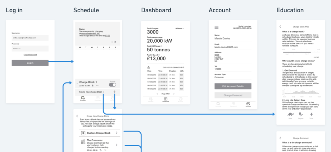
We found that, when it comes to home-charging, the level of involvement from individuals varies in terms of scheduling their charging sessions and tracing the cost of charging. Our research revealed that certain users preferred to set their car to charge at very specific hours to save them money, sometimes determined by a late-night energy tariff. Other users were intimidated by the details required for creating schedules according to times and tariffs, and so would prefer to simply arrange for their car to be fully charged and ready to drive in the morning.
Our research revealed that certain users preferred to set their car to charge at very specific hours to save them money, sometimes determined by a late-night energy tariff.
With all of this in mind, it became clear to us that an app aimed at these customers would need to provide two different approaches to scheduling charging sessions. We collated and mapped our findings into current and ideal user journeys, and used them to inform the design of our initial wireframes (low fidelity, skeleton-style screens). We turned these early wireframes into clickable prototypes and tested the two approaches to scheduling, as well as the layout of the app, with target customers.
Prototyping, testing and iterating
We tested the initial prototype with home chargers in an attempt to ‘prove or disprove’ the two different scheduling styles. Users were introduced to a basic ‘charge me til’ version – for those simply wanting a full charge in the morning – and an ‘advanced’ version – for those with stricter charging requirements.
After testing with several different user groups, our approach proved to be well understood, and we continued with the direction of this concept. However, we did find that there was a general misunderstanding around the naming conventions used, such as ‘charging blocks’ and ‘‘charging schedules’.
So we took this feedback on board and simplified the messaging, while also working closely with the in-house content design and marketing teams to streamline the experience and keep the tone of voice on brand.
Validation and hi-fidelity designs
As we refined the journeys and the experience through testing, we began to increase the fidelity of our prototypes; moving from concept to product design. We explored a few directions for the look and feel of the app and decided on a light, refreshing and clean look. Our intention was to help elevate the brand to a more modern and innovative style, that customers will be used to seeing from forward-thinking companies in other industries. We used colourful graphics to portray a vehicle’s current charging status at a glance, and replicated the style for setting an alarm on your phone for the charging schedules, which can be turned on and off quickly and easily.
Our intention was to help elevate the brand to a more modern and innovative style, that customers will be used to seeing from forward-thinking companies in other industries.
It’s no surprise as to what we did next – we went back to testing, of course! We tested our high fidelity prototype with its new look and feel, and the simplified labelling suggested in the previous testing rounds, at the EV Centre in Milton Keynes.
This allowed us to validate the app’s functionality, only taking away minor tweaks and improvements that we could make to the details of the interface. After this last round of testing, and final adjustments to the design of the app, we were able to move into the development phase with only a couple sprints left to complete the project.

Outcome
Where are we now?
Within 36 business days, SPARCK and BJSS released the fully functioning app to Google Play and Apple App stores. But the work doesn’t stop there. During this project, we were also able to add an additional Analytics feature which enables our client to track user interactions, learn more about their customers and their needs, and assist with product management and development capabilities in the future. This means the app can be continuously iterated and improved based on real customer feedback and insights.