CASE STUDY Finance
Designing global digital account opening services for a multinational bank
At the time of starting the project, conversion rates for the current account opening were under 5% for this bank, requiring applicants to complete the journey in a single branch. With challenger banks and innovative fintech startups leading the way in reshaping customer expectations and allowing customers to open an account in seconds, our client made seeking parity with these user experiences a priority to ensure continued success in the sector. The solution was to be rolled out in Hong Kong, while shaping the Global design that would later be applied across the globe.
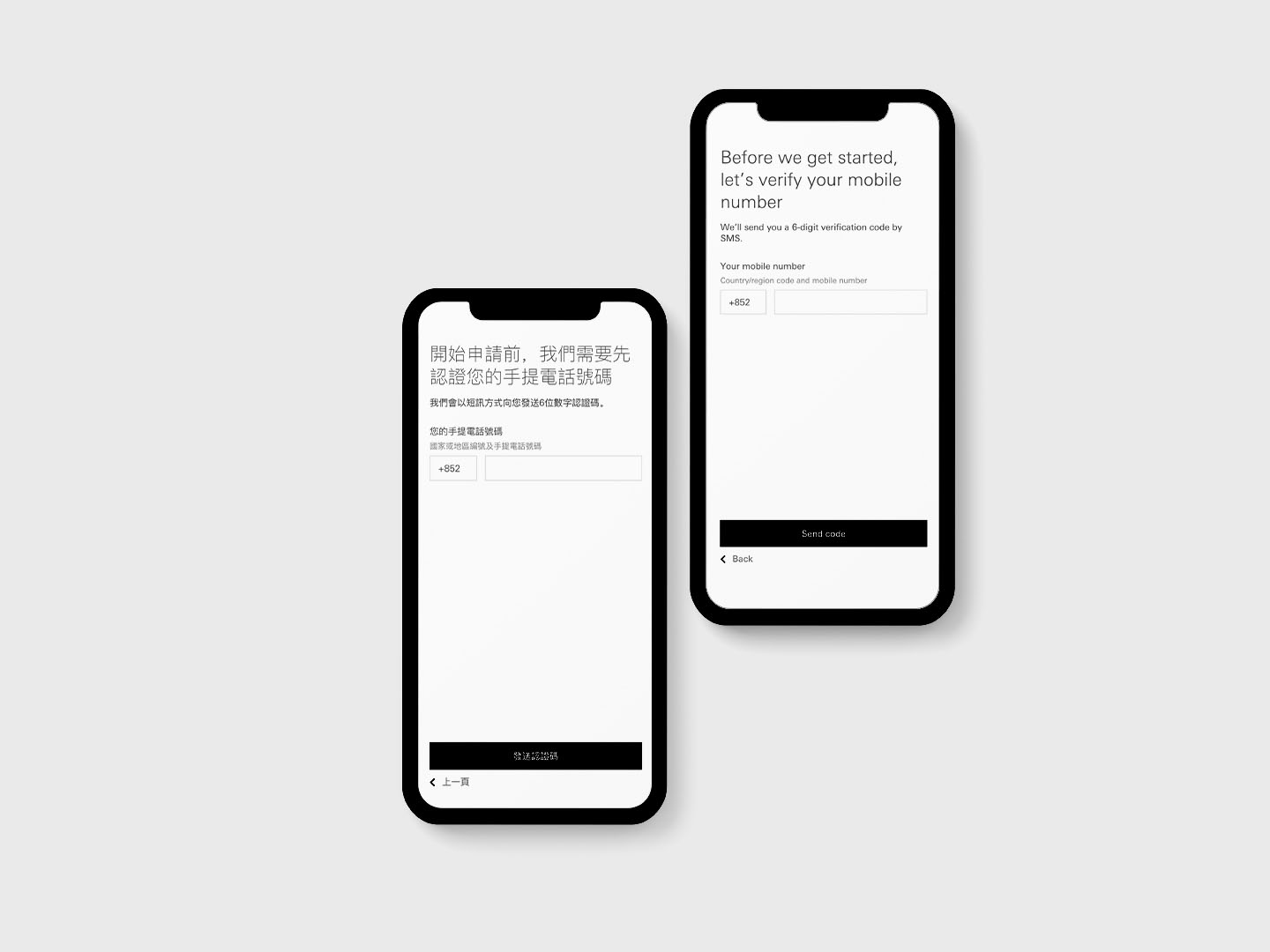
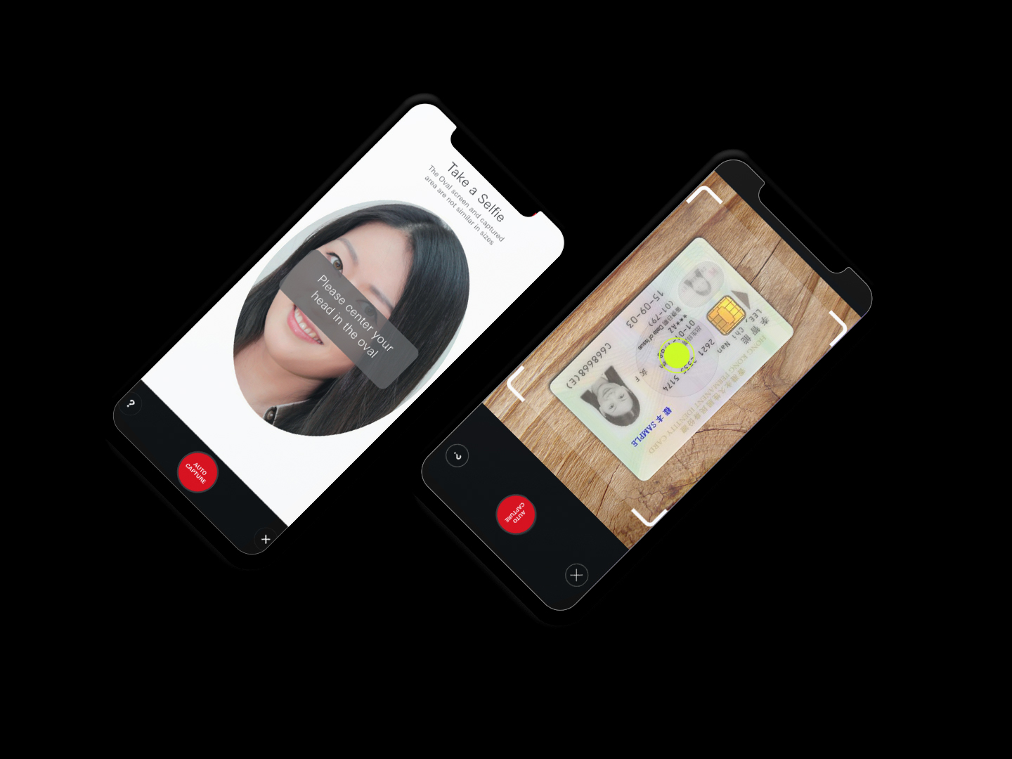
Working in partnership with our client, we delivered a service enabling customers to open an account without the need to visit a branch – the first of its kind in Hong Kong.
Our new, user friendly journey allowed customers to open an account faster, reducing the time taken to complete an application to around 8 minutes, down from a previous 20 minutes. With the delivery of a scalable design system, allowing for large scale circular forms, we have together released multi-lingual account opening journeys in not only Hong Kong, but Canada, Mexico and the UK too.
Testing with a Live Alpha
With a cross-functional delivery team, including product designers, developers, back-end integration experts, Enterprise Agile delivery leads, and software testers, we combined design thinking methods and agile approaches, placing increased value for customers as primary indicator of success.
Designing journeys for financial services presents some unique challenges. Our initial research revealed to us that users can be intimidated by the amount of detail required for a successful application.
With the aim to reduce the cognitive load of the application, we hypothesised that users are more likely to abandon the on-boarding journey prematurely due to this, and used prototypes to validate the theory for the client and their customer due diligence team, encouraging them to review the amount of questions needed.
We also tested a ‘progressive reveal pattern’, only revealing certain questions to a user based on how they answered the preceding questions and found that breaking up the question sets into distinct thematic sections (such as, personal, residential, employment, financial and account usage details) also had a measurably calming effect on users, who were then far more inclined to complete the application process.
After initial research, we began designing and developing live alpha versions of the service. We worked in sprints focused on identifying and addressing technical, integration, usability and accessibility issues in advance of the final product launch. This gave us the ability to validate our ideal journey with users at a far higher level of fidelity, and across multiple regions.


Have a project for us?
Whether you have a business challenge for us, or you just want to hear more about what we do, we’d love to hear from you.

