

Google Chrome has some great built-in features that can help designers, from a colourblindness simulator to a hidden full-page screenshot function.
In this post, I've picked five of the features I use most, and which most often surprise my fellow designers.
Chrome has gradually swallowed up the browser market over the past decade, becoming almost ubiquitous on our desktop computers.
While there are a lot features to love on the surface, purely as a web browser, it's well worth getting to know it better if you're a designer.
The functionality on offer is broad and can be a little daunting to begin with, particularly if you've not encountered much of the nuts and bolts of web development before.
That said, there's nothing to be afraid of, nothing that can't be undone, and no way of breaking anything. So, experimenting is risk-free. Have a play!
While these functions are primarily aimed at designs that have already reached a prototype stage – using a framework such as the GOV.UK prototype kit – some can also be useful in the context of web-based tools such as Figma and Miro.
#1 See the world through someone else's eyes
Chrome is packed with features than can help us make our designs more accessible by showing us how they look and feel to people with accessibility needs.
They can also be used to demonstrate this to stakeholders and win buy-in on the importance of accessibility.
By now, as design practitioners, we should all know the importance of ensuring that the services we create are accessible for everyone.
A key component of accessible design is ensuring that users with visual impairments – an estimated 2.2 billion people, according to World Health Organisation estimates – are able to see the pages we create clearly.
Here's how Chrome can help.
Lighthouse
First up is a feature called Lighthouse which offers a quick and easy accessibility audit.
While it’s far from a water-tight solution for accessibility auditing, it can help designers and developers alike perform a quick check against web content accessibility guidelines (WCAG), and especially the perceivable and operable sections of WCAG's four principles.
To access Lighthouse, you'll need to open Chrome's Developer Tools. That's something you'll become familiar with by the end of this article.
The quickest way to open the Developer Tools is with a keyboard shortcut:
- Option + ⌘ + i on macOS
- Shift + Ctrl + i on Windows
You can also find it under Chrome's View menu.
The developer tools will open either in a panel within the existing window or in a separate window, which you can reposition using the three-dot menu at the top-right of the Developer Tools panel.
Along the top of the Developer Tools panel, you’ll find a number of options, which are worth exploring if this is your first time here.
One of the furthest options to the right of this menu is Lighthouse.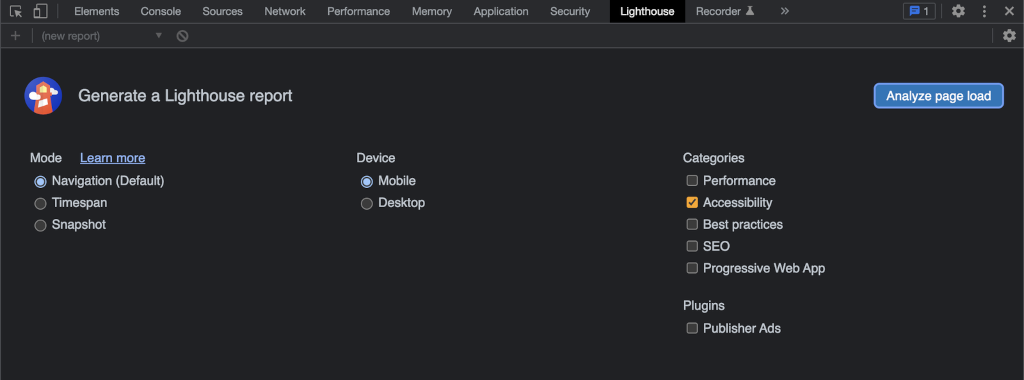
Within Lighthouse, you can select a number of aspects of your prototype to analyse, although you can choose just Accessibility for now.
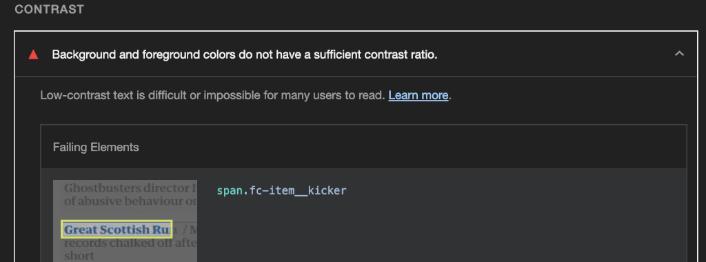
The audit will catch everything from mis-ordered heading levels to poor colour contrast.
Any flaws highlighted contain links to the Deque Systems website with an explanation of the issue.
Deque is a software company that specialises in accessibility, and it's their technology running behind the scenes in Lighthouse.
Each element that has a potential problem is highlighted, so if you're working with something like the GOV.UK prototype kit yourself, or assisting a developer, you should be able to pinpoint where the issues are without too much difficulty.
Content filters for manual tests
Beyond the automated checks you can perform with Lighthouse, Chrome offers a handful of filters that can be applied to web content to perform manual visual tests.
This can be a useful, quick check to ensure that content can easily be read and understood by users with different varieties of colour blindness. For example, are graphs and charts that use multiple colours clear for everyone?
These filters also work well in empathy workshops with members of your team who might not have previously considered accessibility.
To access these filters, open up the developer tools and press the Esc key to bring up the lower drawer.
The three-dot menu that sits at the top of this newly opened drawer contains additional options that aren't visible by default. The one we're interested is called Rendering.
There are a bunch of useful tech-heavy features in here, but if you scroll all the way down, you'll find Emulate vision deficiencies, which allows you to filter the current page to simulate visual impairments.
With these filters enabled, you can quickly see how colourblind users might struggle to differentiate between multiple datapoints in a graph, or how partially sighted users might struggle to read small text in a legend.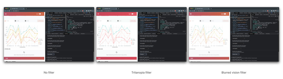
#2 Searching at speed
Chrome ships with functionality that can help you search all the content on your favourite websites more efficiently.
We all have sites we are constantly returning to, searching for resources, people, and content.
The process might sound familiar: opening a site, waiting for it to load, focusing the search box, entering some words, and performing the search.
If you're as bored of going through those steps as I was, you might find this Chrome feature helpful.
Site Search
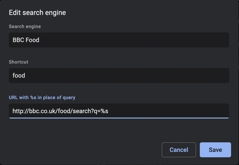
Site Search is a feature in Chrome that allows you to enter a keyword into the address bar to immediately search a specific site.
For instance, I've configured my browser to search the SPARCK SharePoint for assets, resources, and project collateral I might regularly need access to in my practice.
I simply type sparck followed by whatever I'm looking for and I'm taken straight to the SharePoint results page:

To configure this, we need to visit Chrome's settings.
These can be accessed via the three-dot menu in the top-right of the browser, or by pressing ⌘ + on macOS or Alt + F on Windows.
The Search engine option in the lefthand nav contains the option Manage search engines and site search, which is where we can configure Site Search.
The three things you need to start searching are:
- a name for the site
- a keyword to trigger the search
- a URL.
The first two are completely up to you, but the third requires a little more investigation.
When searching sites online, you might have noticed that the words you search for are added to the URL in your address bar.
For example, searching the BBC Food website for apples you'll see this in the address bar:
https://www.bbc.co.uk/food/search?q=apples
The "?q=apples" part of the URL is known as a query string and this is what Site Search uses to perform quick searches.
In the URL field of the Site Search setup, you just need to replace the part of the URL that is your search term – in our case ‘apples’ – with a special identifier: %s.
Once we've populated all three fields, we can perform searches without delay.
#3 All screenshots great and small
Who doesn’t love a good screenshot? We designers use them in workshops, presentations, and more.
But our window to the web is, more often than not, significantly smaller than the total contents of a web page that we’re hoping to share.
While there are plenty of browser extensions and web-based tools to help you screenshot all of what you need, there is actually functionality to do this built right into Chrome.
To get started with Chrome's screenshot functionality, first open the Developer Tools.
The screenshot controls are actually hidden away in something called the command menu, which can be found by pressing ⌘ + Shift + p (Mac) or Shift + CTRL + P (Windows) whenever the Developer Tools are open.
This brings up a combo box into which you can type commands.
As you type, various commands will be presented to you, which you can then execute by pressing Enter.
By typing screenshot you'll see a list of options.
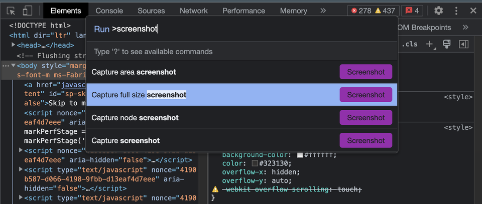
There are a few options available:
- Capture area screenshot – this will bring up a rectangular marquee tool in the page, that you can drag around content to grab.
- Capture full size screenshot – this will capture the entire page, from top to bottom, which is good for really long pages.
- Capture node screenshot – this is used in conjunction with the elements view in the developer tools. If you move your cursor over each element in elements pane, you'll find that parts of the webpage will be highlighted (these are HTML nodes). If you select one of these before running the screenshot command, everything within that HTML element will be screenshotted.
- Capture screenshot – this will screenshot whatever is currently visible in the page, but not what is above or below it.
One particularly useful aspect of this functionality is that it works in conjunction with the rendering filters described in point #1, above, meaning you can grab screenshots of what your pages look like through different filters.
#4 Full throttle
When testing our designs, both within internally in our teams and with users, it can be helpful to conduct tests that simulate lower speeds, and Chrome can help.
The services we design are intended to be as frictionless and straightforward to use as possible. That said, the environments that we design and test in aren’t always representative of the conditions our users are in.
Access to technology is recognised as one of the universal barriers to inclusion. Poor connection speed affects around 1,000,000 people in the UK, especially in Scotland. That could ultimately make a service difficult to use for someone.
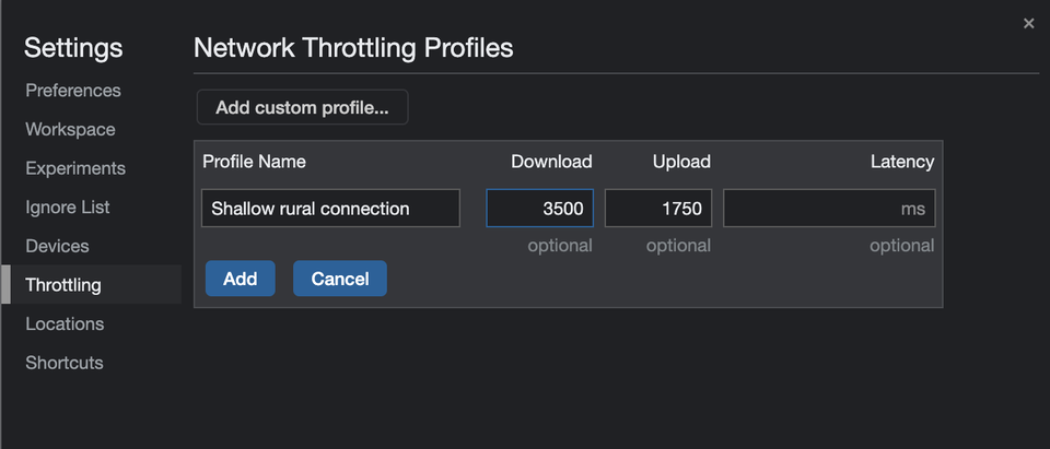
To simulate slower speeds in Chrome, pop open the Developer Tools and press the Esc key to bring up the lower drawer.
Use the three-dot menu in the top-left of the lower drawer and look for the option labelled Network Conditions.
Within this panel, you'll find an input labelled Network throttling. It comes with a couple of presets, although for finer control you can select Add... to specify simulated download and upload speeds in kbit/s.
Again, the practical uses of this functionality extend beyond optimisation of your service.
Concepts such as poor connectivity can often be intangible to those on the project team who haven't considered as part of their design and development process.
Testing with stakeholders who may not appreciate how much more a challenging using a service can be when your connection is slow is a great way to build empathy.
#5 Please respond
Chrome includes a tool that can help you see how your design will look on mobile devices.
Mobile first became the mantra of many designers during the widespread adoption of smartphones over the past 15 years but having a range of devices on hand can still be challenging for design and development teams.
Luckily, Chrome includes a way of simplifying the process of responsive design.
To find this option, open up the Developer Tools and look towards the top-left of the panel. You'll see a small icon showing a phone in front of a tablet.
Selecting this option will resize the viewport around your current window, with handle controls at either side for manually resizing the viewport, a set of device options for pre-configured dimensions, and inputs for entering exact dimensions.
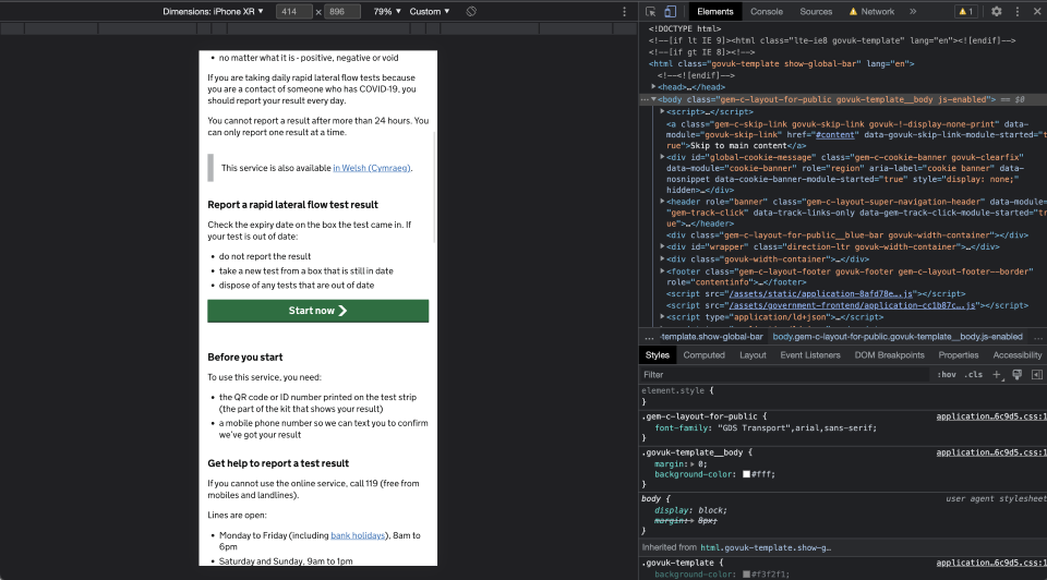
As an added bonus, accessibility auditors such as the Digital Accessibility Centre recommend testing WCAG success criterion 1.4.10 (Reflow) by using the responsive control to set the viewport size to 320px by 256px and ensuring no content overflows horizontally.
It's still okay for the user to scroll in one-dimension, in this case vertically, but if they're required to scroll in two dimensions to read content then you're not meeting the WCAG AA standard, which means your service wouldn't pass a GOV.UK service standard assessment.
What next?
Well, first of all, do fire up a web page, any web page, and have a play.
Then, if you've found this useful, I'd recommend following SPARCK on LinkedIn. Between us, we post quite a few tips and guides there.
And you're also very welcome to connect with me.